- Exhibit Lighting
- Prism Original Series
- Lovo™ Edge Series
- LED Display Arm Lights
- LED Light Stands
- LED Flexible Strip Lighting
- LED Light Panels & Signage
- LED Down Lights
- High Bay LED Lighting
- LED Rigid Strip Lights
- LED Aluminium and Silcone Profile Extrusion
- Connectors & Cabling
- LED Accessories
- LED Controllers
- DMX LED Lighting
- MADRIX Lighting Control
- Programmable Lighting
- LED Lamps
- Power Supplies
- Battery Solutions
- Clearance
- More Lighting Options
- Commercial Lighting
- Retail Lighting
- Lovo™ LED Series
- What We Do
- Who We Are
- Resources

The Importance of Color Temperature in LED Lighting
Tuesday, June 11th, 2019
Just like painting your walls, there are different color temperatures to think of. There isn’t just one “white” paint color to choose from and each has a different effect that you may want for your specific room. Lighting is the same. The type of color temperature you choose has an effect on your brand colors and attracting customers to your business.
Color temperature is so important, with yellow halogen lighting still being the majority of lighting, having a natural white light will make you stand out in a sea of booths. The color temperature (CT) in many booths that you see have different white tones, from warm whites to cooler whites. It is important that all the white lighting is the same color temperature if you have strip lighting and cabinet lighting you want to do your best to make sure that they are the same or close to the same CT.
With LED you can achieve a Hi CRI (Color Rendering Index) for a pure white light that will not change the colors printed in your graphics or your product colors. When you have a yellow light like halogen you change the true pantones of your products and graphics.
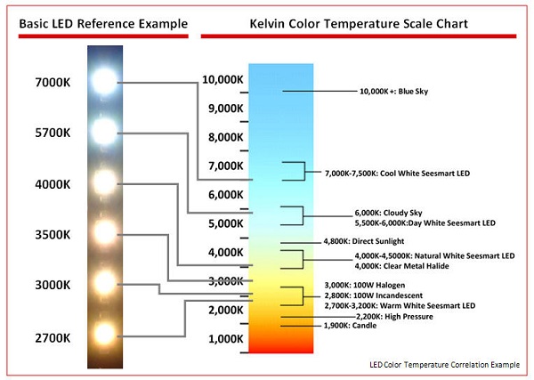
Warm tones or warm white (2700-3500K), is generally used on wood grains and earth tone decor for warm, inviting social lighting. The warm white will give you a yellowish lighting effect similar to incandescent.
Natural tones (4000-4500K) is used more for beige and light color decor. This color temperature is best for product enhancement as it’s color temperature does not take away from the natural colors of your graphics and products. It is a white light very similar to a cool white fluorescent light.
Daylight or pure white tones (5500-6500K) is best on whites and for making your graphics pop, when rear or side lighting in a lightbox. Note that you should use a pure white tone in your light boxes. Watch out for the bluish white light sometimes found with LED-lit sign boxes, as that bluish white light truly does take away from your graphics.

Now that you know the importance of color temperature, this should help you pick the best color for your design.
For help deciding the best color temperature for your lighting project, talk to one of our lighting experts at Prism Lighting Group.

